Category Archives: GINI

Are You Smarter Than A Three Year Old: Inequality and fairness

It’s no secret Obama is going to bang the “It’s not fair” drum this election.  Hell, he’s been bangin’ it since LAST election.  He’s continually calling for the rich to “pay their fair share.”  He can’t rub two speeches together without mentioning that everyone should play by the same rules.  Even more, he continues to claim that the richest among us have been doing exceptionally well in the economy while the rest of us are seeing wages stagnate for the last 30 years.

Don’t forget that it isn’t true:

 The claim that the standard of living of middle Americans has stagnated over the past generation is common. An accompanying assertion is that virtually all income growth over the past three decades bypassed middle America and accrued almost entirely to the rich.

The findings reported here—and summarized in Chart 8—refute those claims.  Careful analysis shows that the incomes of most types of middle American households have increased substantially over the past three decades.

So if it isn’t true, why does Obama continue to bang this drum?

Because he thinks that we think it’s true.

Continue reading

The Impact Of Marriage: Poverty And Children

I have been making the point that one of the contributors to poverty, income disparity and perhaps income mobility is marriage.  I’ve been making the case that marriage tends to bring people out of poverty and failing to get married tends to make one more likely to experience poverty.

For example, I’ve demonstrated that the GINI, or disparity in income, falls as the marriage rate increases in a population:

  • 50% Marriage:  .3446
  • 60% Marriage:  .3353
  • 70% Marriage:  .3227
  • 80% Marriage:  .3015

As the marriage rate went up, the GINI went down.  In other words, as my population increased its marriage rate the inequality diminished.  In fact, by moving from a 50% marriage rate to an 80% rate, the GINI moved by 12%.

Let’s do it again.  10,000 new salaries, same constraints:

  • 50% Marriage:  .3471
  • 60% Marriage:  .3416
  • 70% Marriage:  .3248
  • 80% Marriage:  .3093

Again, a continuing trend toward equality.

As the population marries, the GINI falls.  And this is just a mathematical observation, it has nothing to do with the social benefits that occur due to marriage.

Further, data from the Urban Institute and American University shows that marriage impacts poverty in more concrete ways:

The gains from marriage extend to material hardship as well. About 30 percent of cohabiting couples and 33-35 percent of single parents stated that sometime in the past year they did not meet their essential expenses. These levels are twice the 15 percent rate experienced by married parents. Even among households with similar incomes, demographic and educational characteristics, married couples suffer fewer serious material 21 hardships. Moreover, despite their less promising marriage market, low-income and less educated mothers who are married experience significantly less material hardship than low income,
less-educated mothers not married.

Marriage retained an advantage in limiting hardship even among families with the same incomes relative to needs. The variables used for controlling for the effect of income to-needs ratios were the income-to-needs ratios in the current wave of SIPP (the prior four month period) as well as the mean level and the stability of income-to-needs ratios during the 28 months prior to the current wave. Not surprisingly, higher current welfare ratios, higher past welfare ratios, and lower instability of welfare ratios were all associated with less hardship. However, the inclusion of the income variables left intact virtually all of the differences by marital and family status.

Families that fit in the same income that are married fare better than families that are not married.

The other day I posted on poverty and how to avoid it.  One of the key barriers to middle class is not getting married:


The Immediate Prerequisites to Success Are:

  1. Receive a good education [graduate high school]
  2. Work full time
  3. Marry [And do it before having kids]

But do we have data?  Have we been able to demonstrate that marriage is a determining factor?

Yes.  There is data that backs up the idea that marriage, and just marriage, would reduce our poverty rate significantly:

Economists Isabel Sawhill of Brookings and Adam Thomas of Harvard have conducted a fascinating analysis of whether higher marriage rates would reduce poverty in the United States.4 Employing statistical modeling, they analyzed data from the Census Bureau to determine how poverty would be affected if poor people behaved differently. In particular, they modeled the effect on poverty rates of more work, more marriage, more education, and fewer children by poor adults. In the case of marriage, they simply matched unmarried people by age, education, and race until the marriage rate for the nation equaled the marriage rate in 1970. This exercise showed that if we could turn back the clock and achieve the marriage rate that prevailed in 1970, poverty would be reduced by well over 25 percent.

Impressive indeed.  Simply returning to 1970 rates of marriage, we would be able to realize a significant improvement in our poverty numbers.  And to put this in perspective, social welfare programs aren’t even close when it comes to effectiveness:

By way of comparison, doubling cash welfare would reduce poverty by less than one-third as much as increasing marriage rates.

We could double spending and reduce  poverty.  But it would only be one-third as effective as getting people to get married.

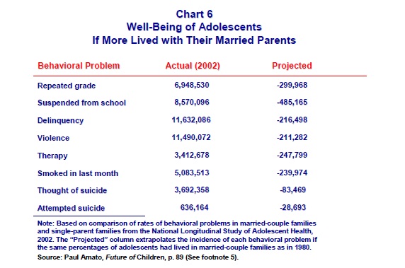
And as a way of comparison, look at the impact of poverty on kids and what reducing that impact by getting married would do:

Marriage, and the declining marriage rate, is a key to poverty in the United States.

Income Inequality, The GINI and Marriage

I continue to question the GINI calculation comparison of nations in order to determine how well wealth is distributed within those nations.  For example, I have a specific problem with the fact that the United States has seen a significant rate of marriage decrease in its population over the last several decades.

As an example, I used a population of 4 and computed the GINI if they were all single:

24,000 – 30,000 – 50,000 – 75,000  The GINI came to .24162

If we marry 2 of those we might see:

24,000 – 50,000 – 105,000 This GINI is .301676

If we marry a different 2, we might see:

54,000 – 50,000 – 75,000 This GINI is .093110

Clearly the makeup of the population impacts the GINI coefficient.  In this analysis, I was called on small sample size.  Fair enough.  I did the data on a population of 10,000.

I took a random sampling of 10,000 salaries.  These salaries ranged from $0.00 to $250,000 and formed a near perfect bell curve with an average of $125,000.  Clearly this is not how wealth is distributed in real life, but I am simply making a point.

I then created 4 worlds.  Each world had a different marriage rate; 80-70-60-50%.  An acknowledge flaw in my data is that I do not randomize the single people each time.  That is, in the first world where 80% of the population is married, I take the first 2,000 and mark them single.  I then marry the 2001st individual to the 6,001st individual.  Then the 2002nd individual to the 6,002nd individual and so on.

My results:

  • 50% Marriage:  .3446
  • 60% Marriage:  .3353
  • 70% Marriage:  .3227
  • 80% Marriage:  .3015

As the marriage rate went up, the GINI went down.  In other words, as my population increased its marriage rate the inequality diminished.  In fact, by moving from a 50% marriage rate to an 80% rate, the GINI moved by 12%.

Let’s do it again.  10,000 new salaries, same constraints:

  • 50% Marriage:  .3471
  • 60% Marriage:  .3416
  • 70% Marriage:  .3248
  • 80% Marriage:  .3093

Again, a continuing trend toward equality.

Does my theory have legs in the real world?  I think it does:

Inequality is typically higher as the percentage of married people declines and as the correlation of of partner’s income increases.  Inequality also tends to be higher when low-income earners are disproportionately likely to remain unmarried.

In other words, the more people marry, the more equitable income is.  Especially when this trend is observed in low income individuals.

Further data suggests that poverty is addressed by marriage:

As expected, the results clearly show that married parents experience lower poverty rates and higher incomes not only than single mothers living without another adult, but also among those unmarried mothers with at least two potential earners. Poverty rates of cohabiting couple parents are double those of married parents; non-cohabiting single parents with at least a second adult had poverty rates three times as high as among married parents.  The apparent gains from marriage are particularly high among black households.

The gains from marriage extend to material hardship as well. About 30 percent of cohabiting couples and 33-35 percent of single parents stated that sometime in the past year they did not meet their essential expenses. These levels are twice the 15 percent rate experienced by married parents. Even among households with similar incomes, demographic and educational characteristics, married couples suffer fewer serious material 21 hardships. Moreover, despite their less promising marriage market, low-income and less educated mothers who are married experience significantly less material hardship than lowincome,
less-educated mothers not married.

In short, marriage matters.  And for whatever reason, the United States is becoming a less married nation.  If you wanna address poverty, inequality and hardship, focus on getting people, especially low-income people, married.  Failing that what you are doing is transferring wealth from one population to another in an attempt to “wish” you way out of reality.


Marriage In The United States Of America

Last month I made a claim that one of the reasons the GINI coefficient, a measure of the disparity in income, is not telling the whole picture in America is that it doesn’t reflect the true concept of households.  I made the case that:

For example, you could take 4 people with incomes described as:

  1. $24,000
  2. $30,000
  3. $50,000
  4. $75,000

The Gini coefficient for the above data is .24162

Now, marry two of those wage earners:

  1. $24,000
  2. $50,000
  3. $105,000

The Gini coefficient for THAT data is .301676.  Without ANY income changing at all, the Gini increases by 25%.  In other words, the same number of people are working the same number of jobs and earning the same number of dollars.  The only difference is the method by which they calculate the Gini.

Nickgb over at Poison Your Mind called shenanigans.

You are taking a nation-wide economic statistic, applying it to a population of four, then three, and drawing conclusions as to its usefulness?

Certainly my math was simple.  It consisted of a population of 4 individuals.  Clearly this was just a demonstration of what could or might occur in a larger group.

However, since then, we have learned that a record number of Americans are unmarried:

Barely half of all adults in the United States—a record low—are currently married, and the median age at first marriage has never been higher for brides (26.5 years) and grooms (28.7), according to a new Pew Research Center analysis of U.S. Census data.

In 1960, 72% of all adults ages 18 and older were married; today just 51% are. If current trends continue, the share of adults who are currently married will drop to below half within a few years. Other adult living arrangements—including cohabitation, single-person households and single parenthood—have all grown more prevalent in recent decades.

Certainly there is nothing wrong with people deciding that they would rather enjoy life’s treasures as a single person rather than a married person, but it is also true that when measuring household income using the GINI coefficient, a drop in marriage rate of 33% will impact the results.


GINI Coefficient

The latest report from the OECD should make those in favor of redistributive policies vindicated in their opinion that the income disparity is growing.  Data suggests that it is:

THE gap between rich and poor has grown ever wider in wealthy countries over the past three decades. A new report by the OECD has reams of data on this phenomenon and is well worth looking at. The Gini coefficient, a measure of inequality in which zero corresponds to everyone having the same income and one means the richest person has all the income, increased by almost 10% from 0.29 in 1985 to 0.32 in 2008, for working-age people in OECD countries. The trend is caused by earnings: the pay of the richest 10% of employees has increased at a far greater rate than that of the poorest 10% of employees. Within the upper echelons, the top 1% have reaped the greatest gains.

I have ideas about why this gap is growing.  I think that much of it is the way in which they measure the Gini.  For example, you could take 4 people with incomes described as:

  1. $24,000
  2. $30,000
  3. $50,000
  4. $75,000

The Gini coefficient for the above data is .24162

Now, marry two of those wage earners:

  1. $24,000
  2. $50,000
  3. $105,000

The Gini coefficient for THAT data is .301676.  Without ANY income changing at all, the Gini increases by 25%.  In other words, the same number of people are working the same number of jobs and earning the same number of dollars.  The only difference is the method by which they calculate the Gini.

But are there other reasons for the Gini to increase?  Why yes:

Technology has disproportionately benefited high-earning workers, who also spend far longer at work than do low-earners. High earners marry other high earners. And governments are doing less to redistribute wealth than they have done in the past. So far, so familiar. But the report also argues that globalisation is not a significant cause of inequality, and that one of the many reasons for the rise in income inequality is that more people are in work now (or at least they were before the financial crisis hit) compared with the 1970s.

So, we have factors such as:

  1. Technology has helped the wealthy [did it create them?].
  2. Productive people marry other productive people .
  3. Governments are correctly not redistributing wealth.
  4. More people are “in work” now.

In the end, I’m not sure that the use of the Gini is an appropriate measure of income disparity.  Further, I’m not sure it even matters.

Wealth And Distribution: II

A week and a half ago I posted about the distribution of wealth in a controlled population of people that were EXACTLY like one another.  Exactly.  They contributed to 401ks the same, they saved for houses the same, they worked at the same wages and got raises the same.  The result, after just 15 years of life?

…the poorest third of people control less than 20% of the net wealth while the richest 14% control more than 20% of the net wealth.

6/15th’s of the poorest control less money than the top 2/15ths.

I have expanded my model to include home ownership.  Again, this is done with the assumption that ALL people do the EXACT same thing in the same way.  They buy a house at the same time, in the same housing market and the home they buy is worth the same.

Here’s what we get:

Again, the money shot:

Total
Worth
$20,150.00
$41,065.00
$62,768.00
$85,282.81
$108,633.07
$132,996.30
$155,049.73
$178,141.44
$202,303.53
$227,569.27
$253,973.07
$281,551.59
$310,340.71
$340,378.62
$371,702.83
$414,013.44
$455,546.94
$498,681.75
$543,467.99
$589,958.54
$638,156.14
$687,997.39
$739,532.90
$792,816.28
$847,903.24
$904,848.64
$963,712.56
$1,024,553.38
$1,087,433.82
$1,152,418.08

The control of wealth explodes after year 15.  That’s when my peeps buy a house.  What was a net worth growing by about 30k a year now grows much quicker; near 40 or 50k a year.  And this is just by buying a home.

So, after 30 years, where is the wealth?

The total wealth is $14,112,947 with a quintile at $2,822,589.

The lowest quintile.  That group of people that control the bottom 20% of the wealth in this equal society, defined equal society, compromises fully HALF the people in that society.  The bottom HALF of our population controls just 20% of the wealth.    The top 3/30, or 1/10th or 10% control 20% of the wealth as well.  In fact, the top 3% controls as much wealth as the bottom 33%.

And we’re just 30 years into the life of the exactly average 18 year old.  We’re just at 48 years of age.  We haven’t even begun to take into account poor choices or good choices.  This model is assuming that all kids make the exact same choices with their money, career and finances.

And we STILL have “wealth distribution” issues.

Wealth and Distribution

Occupy Wall Street is having an impact.  There’s little doubt that they have generated much conversation and debate.  Some think that the impact they’ve had is positive; others negative.  For me, it’s focused the debate on income distribution, income mobility and wealth distribution.

We’ve talked about the GINI.  That’s the tool, in general, that measures distribution.  It could be World Series Titles or brown hair.  It could be the letter “W” in license plates or it could be income.  And I’ve come to the conclusion that the GINI, as reported by the major players, isn’t reporting anything useful.  The GINI measures income per family.  And all families aren’t created equal.

So, next up is wealth.  This time I built a thought experiment.  A simple and crude one to be sure, but, based on feedback, could be refined.  In fact, it’s my goal to refine it as I go.  The idea is to create a world that is as equal as possible.  I’ve built a population that is the same in every regard.  They make the same, save the same and spend the same.  And they advance the same.  Given such a world, what does income and wealth distribution look like?

Let’s look at wealth.

I assume a number of things.  All in the name of equality:

  1. 1000 people per year
  2. A starting salary of $30,000
  3. A raise of 3% a year.
  4. Progressive living: roommate-own apartment-saving for home
  5. Progressive retirement savings – none to 401k
  6. Rent and food don’t increase in real terms
  7. People only have living and food expenses.  And save ALL other money.

If we start at year 1 and continue to build our population, it looks like this for the first 15 years:

The graphics are tough to see without clicking through.  Lemme give ya the money shot:

Total
Worth
$20,150.00
$41,065.00
$62,768.00
$85,282.81
$108,633.07
$132,996.30
$155,049.73
$178,141.44
$202,303.53
$227,569.27
$253,973.07
$281,551.59
$310,340.71
$340,378.62
$371,702.83

Using the gross assumptions above, I have identified the “Total Worth” of the individuals year over year.

Each row above represents another cohort advancing and the previous year taking it’s place.  That is, this year’s “Year Ones” becomes next year’s “Year Twos”, And this year’s “Year Twos” become next year’s “Year Threes”.

We like to break down distributions by quintiles.  Let’s do that.  Let’s break it down by quintile.

If you sum all the wealth of the 15 represented years, you get $2,771,905.  If you divide $2,771,905 by 5 you get $554,381.  The first SIX years of cohort classes don’t equal one single quintile.  On the other end of the spectrum, just 2 cohort classes are at $712,081.  Nearly 40% more than the top quintile.  In other words, more than the poorest third of people control less than 20% of the net wealth while the richest 14% control more than 20% of the net wealth.

6/15th’s of the poorest control less money than the top 2/15ths.

And this in a world controlled by exact equality and accounting for no good/bad decisions.

GINI: Further Clarification on Wage Earners

This morning I posted on the flaw of using the popular measure of income disparity across nations.  Many organizations use the GINI coefficient to measure this disparity.  However, what these organizations fail to mention is that they are measuring household disparity, not individual disparity.  And when they compare nation to nation, they don’t normalize those numbers so that we’re comparing apples to apples.

For example, in the United States, a massive amount of “households” is comprised of single parents.  That is, the home will find a single eligible wage earner.  And many of those parents opt not to work.  Now, some will say that’s because there is no work to be had.  Others, me included, will say that the incentives are all wrong.  The entitlement programs offer enough aid that the prospect of going to work doesn’t make sense.

So, no income.

Is this sad?  Most certainly.

Does this promote poverty generation to generation?  With out a doubt.

Is this a serious problem that requires serious thought?  Yes.

Does this implicate the job market, compensation structure or some inherent bias towards “the wealthy”?  Under no circumstance.

This morning I showed the “horizontal” version of the data.  Let’s look at the vertical:

Descriptor Lowest Fifth Second Fifth Third Fifth Fourth Fifth Highest Fifth
No Earners 62.4% 29.6% 14.0% 6.3% 3.0%
One Earner 33.0% 52.6% 48.4% 33.1% 22.2%
Two Earners 4.3% 16.0% 32.4% 49.3% 55.9%
Three Earners 0.2% 1.6% 4.4% 8.9% 13.1%
Four Earners 0.0% 0.2% 0.8% 2.4% 5.8%

The data continues to reveal reality.  The quintile that represents the poorest among us, the “Lowest Fifth” has 62.4% of it’s members with ZERO wage earners.  That is, more than half, WAY more than half of the poorest quintile has no one in it making any amount of money.  NONE.  There is no way that this can be counted towards any measure of income disparity.  For that to happen, there must be an income!

I have lived in North Carolina for 12 years [damn!  12 years] and I have never won the North Carolina lottery.  Never mind that we have had a lottery for only 7 years and that I’ve never bought a ticket.  Is it realistic that I be counted among lottery players that haven’t won?

No.

Back to the data.  The “Lowest Fifth” has 62.4% of its members with no income.  62.4%.  Compare this to the “Highest Fifth”.  That quintile has 3% with no wage earners.  Three.  Further, the “Lowest Fifth” has only 4.5% of its membership with 2 or more earners.  Compare that with the “Highest Fifth” who have 5.8% with FOUR wage earners.

It turns out that a predictor of income is, shockingly, the number of wage earners.

GINI: Income Disparity

Thursday I posted my thoughts on the GINI rating and how it pertains to income here in America.  In that post, my main thrust was the fact that GINI, as reported when comparing national income disparity rankings, was comparing household incomes.  Not the incomes of individuals, but of households.

And I think that’s important.  As I demonstrated in that post, taking these two families:

  • Family A making $60,000 a year
  • Family B making $70,000 a year

Looks to be fairly equitable.  But now let’s consider that family A and family B get divorced, created 4 households out of two.  Then the breakdown looks like this:

  • Family A making $0 a year
  • Family B making $28,000 a year
  • Family C making $32,000 a year
  • Family D making $70,000 a year

THIS looks to be dramatically different.  However, the same four families in the second picture are the individual household represented in the first picture.  Remarkable, yes?

So, how do things look in real life?  Let’s take a look at the US Census Bureau’s Current Population Survey for 2010:

Descriptor Lowest Fifth Second Fifth Third Fifth Fourth Fifth Highest Fifth
Family Households 9,411 13,969 16,162 18,543 20,528
% 12 17.8 20.6 23.6 26.1
Married Couples 4,037 8,521 11,587 15,270 18,621
% 7 14.7 20 26.3 32.1
No Earners 14,805 7,037 3,327 1,496 722
% 54.1 25.7 12.1 5.5 2.6
One Earner 7,845 12,474 11,488 7,853 5,263
% 17.5 27.8 25.6 17.5 11.7
Two Earners 1,020 3,790 7,702 11,700 13,258
% 2.7 10.1 20.6 31.2 35.4
Three Earners 55 379 1,040 2,112 3,119
% 0.8 5.6 15.5 31.5 46.5
Four Earners 5 58 180 577 1,377
% 0.2 2.6 8.2 26.2 62.7
Aggregate Earners 10,240 21,940 31,595 41,125 48,338

The data is remarkable.  Let’s go through it bit by bit.

First, the “Fifths” listed at the top is earnings by quintile.  That is, the poorest 20% is the “Lowest Fifth” while the richest 20% is the “Highest Fifth”.

Now then, the data:

Households that are “families” is a massive indicator of income.As the percentage of families in each fifth increases, so does the wealth.  The same goes for married couples.  The top fifth has nearly 5x the number of married couples as the bottom fifth.  Seems that family is important in wealth creation.

Family aside, the powerful statistic that I took away was the number of earners in a household.  And what I found matches exactly with the phenomenon I described in my earlier post.

Of the households in the bottom fifth, more than HALF don’t have a single wage earner in the household.  More than half.  While the top 20% has only 2.6% of households that don’t qualify as a wage earner.

Further, if you look at the “Lowest Fifth” as a column and march down, you’ll see that fewer and fewer of those households have the described number of earners.  Starting at the top, this segment of the population has 54% of households with 0 wage earners.  While at the bottom, it has but .2% of the households with 4 wage earners.  The exact opposite is true of the “Highest Fifth”.

In short, it would seem that as a household has more wage earners, that household moves from one of the fifths to another.  And to the extent that this is true, look at the last line; aggregate earners.

The “Lowest Fifth” has 10,240 members.  The fifth that earns twice as much money as the lowest fifth has twice as many wage earners.  The fifth that makes three times as much as the lowest fifth has three times as many wage earners.  The fourth has four times as many wage earners.  And the highest has five times the number of wage earners.

This is true almost to the exact number.

The data presented above tells me that we don’t have an income disparity issue.  We have a family structure issue.  If you take a single wage earner in a household and compare that household to one with 4 wage earners, it should be no surprise which of the two households makes more money.

And lest there be any doubt.  The “Highest Fifth”?  They are some working sums -o- beetches.  Fully 62.7% of those households have FOUR wage earners.  This is not the lazy rich that the OWS and the ((% make them out to be.