To be fair, I don’t think that Jon Stewart, CNN or the reporter are bias in their reporting. For his sake, Stewart is just running a clip that makes his point and probably just missed it.
But for CNN and the reporter, their mistake is a little bit more egregious. Again, I don’t think there’s bias, rather, they think they have a story – they might well have- and they are just trying to push the numbers they have to make that story more compelling.
Watch. Hint, it’s all over by 00:35
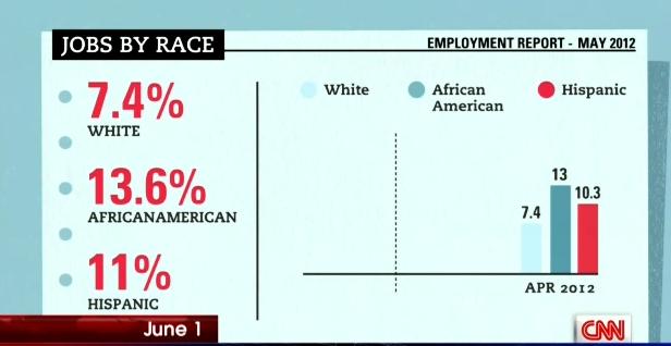
The error was in the numbers the CNN reporter was displaying.
Here is the graphic she used:

So the numbers and the graph are:
The graph accurately reflects the White unemployment. The graph does NOT reflect AfricanAmerican unemployment. In fact, it shows it lower. Then again, the graph doesn’t show Hispanic unemployment correctly either, however it too shows the data as lower than the raw numbers.
Which is right?
Let’s listen:
… in the black community 14% compared to whites which is 7%. Latino community 11% compared to white’s 7%.
In the dialogue we have white unemployment at 7%. Both the data and the chart show it at 7.4% She reports that black unemployment is 14% but the data shows 13.6% and the chart shows 13%. Depending on which you believe, that’s a whole point. Next she moves to Latinos. In both comparisons she mentions 11%; consistent with the data but not the graph.
Again, I don’t think there is bias here. Jon is setting the table for his bit. But Lordy, how do we trust that these people are saying true things?


