Via Coyoteblog
The immediate impact of the legislation is due to the fact that it wasn’t until Christmas eve in the middle of a snowstorm that the democrats wheeled a dying 117 year old man to vote that this was a done deal.

Via Coyoteblog
The immediate impact of the legislation is due to the fact that it wasn’t until Christmas eve in the middle of a snowstorm that the democrats wheeled a dying 117 year old man to vote that this was a done deal.
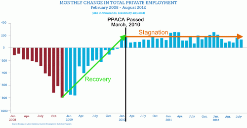
You might want to think again if you want to use that chart. Another way is to point out that there has been constant employment creation since Obama care passed, while before Obama care passed there was increasing unemployment every month except one! Also, if you push out the other side and look at job growth under Bush before 2008 and it’s about the same kind of graph as job growth under Obama – sticking around 200,000 a month. But this picture makes it look like Obama care helpled us get into and stay in positive employment numbers!
this picture makes it look like Obama care helpled us get into and stay in positive employment numbers!
Except the positive trend began before Obamacare was passed. In fact, the beginning of “the recovery” began before Obama took office.
Hahaha! Am I the only one who finds this graph really funny? Amazing what you can do with correlation and numbers, and what patterns one can find if they really want to, isn’t it?
I think I flushed my toilet in Las Vegas around the exact same time that Obama signed the PPCA in. That MUST have signaled the turnaround for job growth! 🙂
Hahaha! Am I the only one who finds this graph really funny? Amazing what you can do with correlation and numbers, and what patterns one can find if they really want to, isn’t it?
I agree that correlation is not causation.
However, there is little doubt that Obamacare is a job destroyer, not creator.