
Given the fact that we are experiencing Global Warming absent any warming in the last 15 years, it’s no surprise that “NPR Staff” totally missed this:
It has been a deadly year for the people who fight wildfires. In total, 32 people have lost their lives fighting fires in 2013; the highest number in nearly 20 years, according to the National Interagency Fire Center.
Just one incident accounts for most of those deaths, the Yarnell Hill fire in Arizona. In June, the blaze blasted through a firefighting crew known as the Granite Mountain Hotshots; .
As people move farther into wildland areas and climate change turns landscapes into tinder, experts say the wildfire danger around the country will likely only grow. But there may be a lesson to learn from how the U.S. stifled an earlier fire crisis in urban settings.
For the benefit of NPR Staff’s readers, here’s the stats:
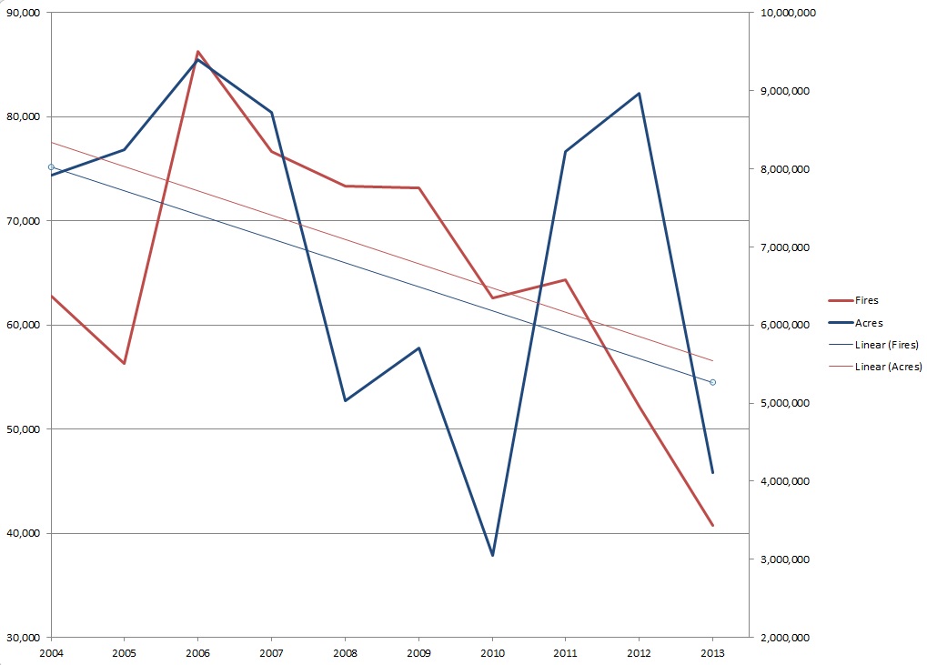
Both the number of fires and of acres burnt are trending down.
You would think that information should have made it into the article.
Where did you get your stats or charts? They are nowhere near reality according to FEMA and the NIFC. Here’s two charts I put together using their numbers for 2003-2012 showing a slight but measurable increase (based on FEMA’s numbers here) and one for 1983-2012 showing a substantial increase in both fires and acreage (based on NIFC’s numbers here): http://imgur.com/a/ygMie#CfJZYuJ
Neither has final numbers for 2013, though it’s clearly been a pretty quiet season just as far as the stats go (unfortunately it’s also been especially deadly). So those trendlines in my charts will get pulled down a bit. For fun, here’s the 1983-2013 chart, using your numbers from above for 2013: http://imgur.com/xKojHOG. As you can see, even with 2013 included, the trendlines are undeniably upward trending.
Where did you get your stats or charts?
Oops, thought I linked it:
Here:
http://www.nifc.gov/fireInfo/nfn.htm
The numbers I used is comparing years to years “to date”
So, when comparing 2010, for example, to thhis year, they take the data from Jan 1, 2010 to “date” 2010.
I’ll look more at the two different data sets.
The numbers I used is comparing years to years “to date”
Ah, that explains the discrepancies. I wondered why they were all close but seemed slightly off.
But either way, do take a look at the historical charts, and you end up seeing that a relatively small increase in fires is leading to much more acreage each time, meaning that:
1) There is an increasing number of fires each year (using a linear fit model)
2) There is an increasing amount of land burned by these fires each year (again, 30 year linear fit)
3) These fires are just getting bigger and bigger on average (which is an interesting and distinct problem from the first two points)
I agree that NPR’s passing mention of climate change was bad journalism, but not because they’re hiding facts, rather it was simply nonsensical as written. They should draw a lot more lines to connect these dots. But the trends you’re alleging here don’t exist when you look at data pre-2004.